Roommates
Scope: User Research, User Testing, UI/UX Design
Timeline: 8 Weeks
Tools: HTML, CSS, Javascript, Adobe XD
Project Overview
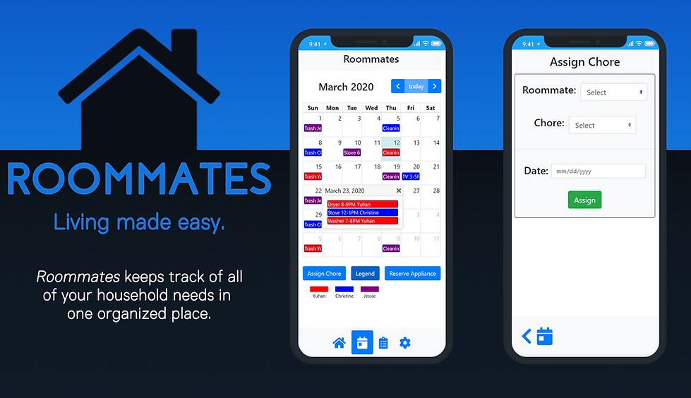
Developed for the 10-week Interaction Design course in UC San Diego, Roommates is a web application that aims to improve the lives of people living together using calendar event tracking. During those 10 weeks, I worked in a team of three, taking the roles of the lead designer and user researcher.
The Problem
Living with others is difficult when there isn’t an organized system to track what everyone is contributing to the household. By keeping track of tasks people have done in an organized manner, Roommates aims to improve your living situation.
User Research and Needfinding
College/University students are a demographic that commonly live with strangers, friends, or other people outside of their family, which sometimes makes communication an intimidating task. As a result, we interviewed 15 people that stated that they live with housemates/roommates, and asked them what they thought about their current or past living situations. Out of 15 interviewees, 73% (11 people) mentioned that some roommates would rarely clean their dishes, take out the trash, or contribute financially to household supplies. 40% (6 out of 15) of interviewees also stated that roommates would constantly use household appliances such as the TV or washing machines and as a result, rarely get to use them when they wanted to. We decided to make Roommates to fix these problems.
User Personas and Storyboards

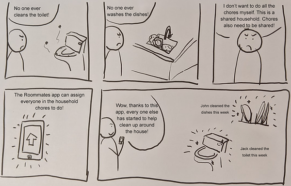
Jesse
Jesse is a high-achieving college student trying to balance his schoolwork, extracurricular leadership activities, and a part time job. After coming home from his work day, all he wants to do is unwind and relax. However, Jesse always seems to return to a dirty apartment where the dishes are unwashed and trash is piling up because of his roommates’ lack of self-responsibility. Jesse wants to set up an apartment meeting to assign chores and tidy things up, but their busy schedules never align. Jesse needs something where he can assign chores to his housemates and will notify them about their responsibilities.
Storyboard for Jesse

Rachel
Rachel has decided to live with four of her friends for the new school year. Because there are five people living in a single household, there are often times where multiple people are trying to use the same shared appliance. Rachel has been trying to do her laundry for a week now, but the washing machine has been in-use every time she checks. She wants to bring this up with her friends, but feels like it’s too minor of an issue. Rachel needs something where she can schedule a reservation for household appliances.
Storyboard for Rachel

Competitive Analysis
From researching other apps that are similar in functionality to our own, we can study the pros and cons of other designs reviewed by real users. Here are two apps we looked into:
RoomMate: Live Together
-
Pros:
-
Can also keep track of expenses
-
Many pre-existing options for chores and expenses
-
-
Cons:
-
Can’t delete certain chores
-
No calendar view
-
Homely - Shared Task Manager
-
Pros:
-
Gives useful data and information about the household
-
Data is color coded and represented in charts
-
-
Cons:
-
Visuals are rather cluttered
-
Some of the text labeling the charts is small and hard to read
-

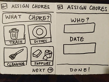
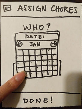
Paper Prototyping
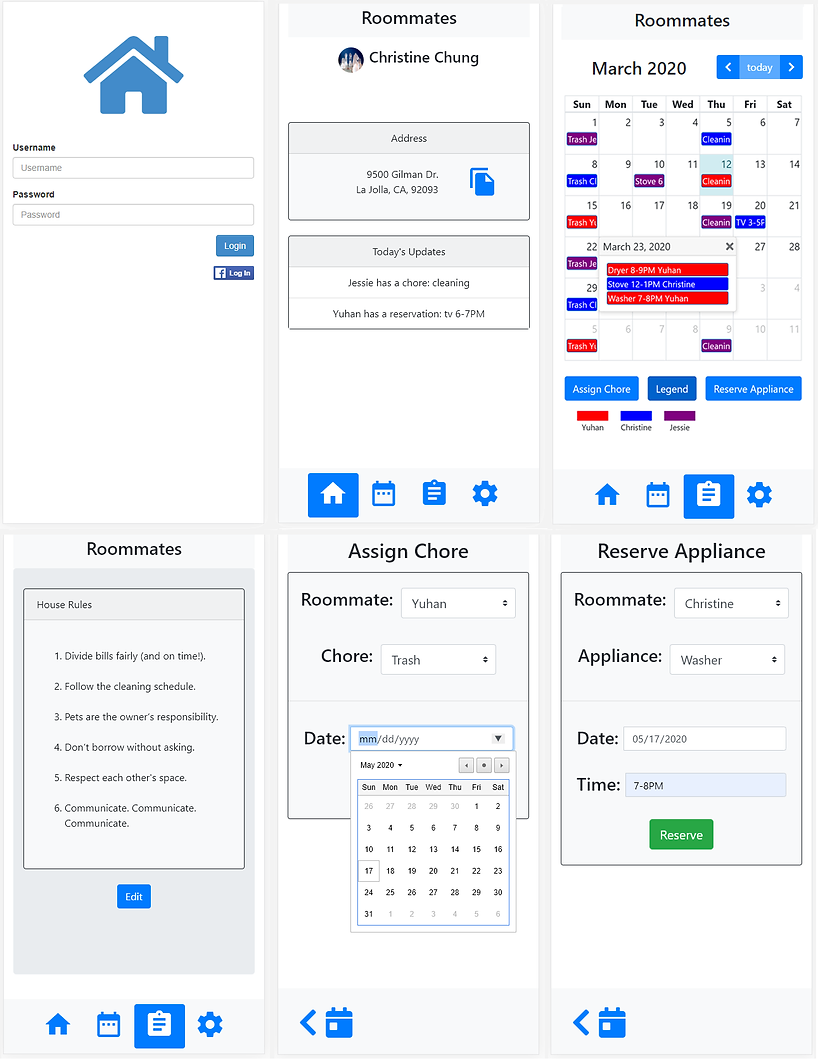
After storyboarding and researching other apps, we drew out paper prototypes with all of the core functionalities we wanted for our app. Our app consisted of five main screens: Home, Calendar, Today’s updates, House rules, and Settings. The home screen served as a menu to navigate to other pages. The calendar screen allows users to view all of the events planned out for the month and is where the user can create appliance reservation and chore events. The today’s updates page is where the user can view upcoming notifications and events for the current day. The house rules page is where the user can view and edit house rules.


User Testing
After three rounds of user testing and heuristic evaluations, many people said they thought the app would be useful and that it was easy to use and navigate through. The main problem that we noticed after receiving critique for this prototype was how there is a lack of feedback after assigning a chore or reserving an appliance, so I made sure to add ‘Appliance Reserved’ and ‘Chore Assigned’ confirmation boxes that appear after the user presses the ‘Done’ button. We also decided to make the ‘Today’s Updates’ page the homepage to reduce redundancy. I thought that the heuristic evaluations were useful because they allow for perspectives outside of the designers’ to be considered and we can see how other people use the app to catch potential problems.
High Fidelity Prototypes

As the lead designer of the app, I was tasked with creating the high-fidelity mockup screens in Adobe XD, while my other two teammates would take the role of writing the code for the app. My team used these wireframes to serve as a guide on how to lay out the functionality and buttons of each screen they would have to program in HTML and Javascript. They would also communicate with me the limitations of what was possible with coding the layouts, and I would have to think of alternate designs to work around them.
Alternative Designs and A/B Testing


To further iterate upon our design and appeal to more modern app design, we decided to change the navigation menu from a side tab to a bottom bar. After launching a working prototype of our app online, we decided to perform A/B testing to determine where we should place the ‘Reserve Appliance’ and ‘Assign Chore’ buttons using Google Analytics. Originally we had the buttons on the calendar screen (A), but we were considering moving them to the home screen (B) to improve accessibility.

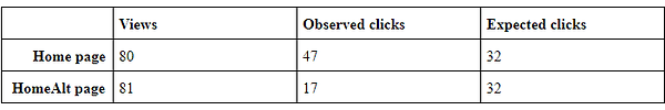
Our A/B testing results concluded that there significantly more clicks on the buttons when they were on the calendar screen rather than the home screen. This is probably because the calendar contextualized the functionality of the buttons more.
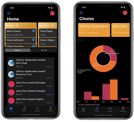
Final Product
After integrating all of our final changes, we launched the app online where it is hosted by Heroku. Being my first major design project, this experience has taught me a lot about web app development and the process of human centered design. Communication among team members is really important during these collaborative design projects, as compromises between visual design and programming functionality are often made.